There are 2 different ways to build Udutu courses. Classic builder or Mobile and each has its own different theme builder. To find out more about our mobile option click here.
The Classic Theme Builder is a very powerful (and often missed) part of the course authoring tool. It allows you to customize the general look of your course including background colours/images, navigation buttons, text size/colour/format, etc. Ideally, you want to use your course theme to dictate the majority of your course’s look and feel. You can then further customize certain aspects on individual screens themselves as needed but the majority of the look will be driven by the ‘Theme’. That’s why it’s called a theme! Usually, creating a custom theme for your new course (or using one already created from others) will become one of the first things you do when starting a new course.
You can find the Theme Builder in Course Tools
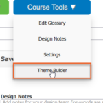
or Administration>Theme Builder

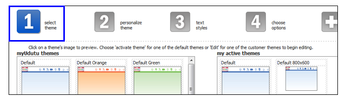
Select Theme
- Start by selecting a Udutu theme to act as a baseline for your custom theme. A library of themes to start with is made available to you on the left.
- Activate one of these themes by selecting the “Activate Theme” button.
- For themes that are already activated on the right, select the “edit” button on the theme you would like to customize.
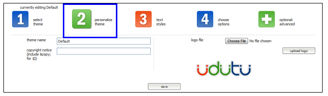
Personalize Theme
- Be sure to add a name for each of your themes. Sometimes you may want multiple versions of a similar theme and so naming conventions will be helpful in differentiating them.
- Add copyright information if applicable.
- To add a logo, click “Choose file” and browse your computer for the image.
- Logos should not exceed 80 pixels in height and should be around 200 pixels wide.
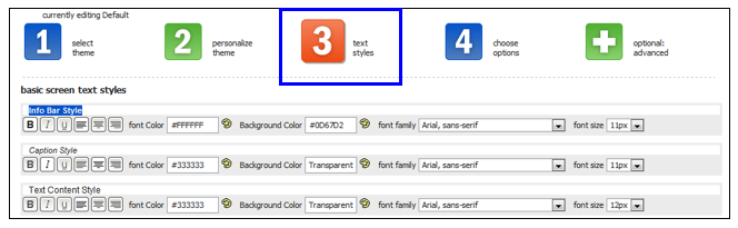
Text styles
You can customize the text in almost every section of your course templates. These settings become the default settings for each respective screen template in your course. As noted in the “Tip” below, in some cases you can still override these theme defaults on a screen by screen basis, however, the ideal is to try and allow the theme to dictate the primary look and feel of your course.
Tip: These settings can always be over-written manually in the text content area on each individual screen.
Choose options
Select which navigation buttons you would like displayed on the screen. Customize the look of these buttons by choosing from the options provided or by uploading your own images. The optimal image sizes for your own buttons is 80 x 90 pixels.
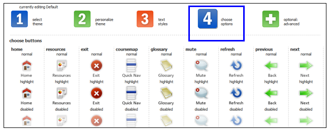
Tip: Images should not exceed 80 x 80 pixels
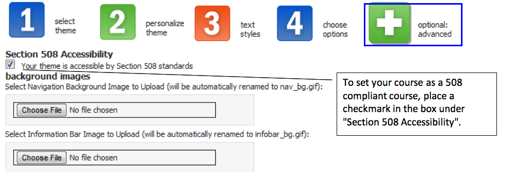
Optional/Advanced customization
Advanced customization allows you to upload new background images for the navigation bar, information bar and content body background. Users can further customize the look of their course using CSS. The course can also be set to comply with Section 508 accessibility standards.